


The Farmer's Dog is a subscription-based pet food company that offers personalized, fresh dog food delivered directly to customers' doors.
The product is most successful when customers are educated and feel confident about investing in a high-quality diet. Typically, this success is achieved when customers call in and chat with CX associates; however, this model is not scalable.
Our goal was to design a self-service model that can provide education, clarity, and guidance for managing customer subscriptions.
I initiated a comprehensive analysis of the current state of the account that included a UX assessment, stakeholder interviews, CX agent workshops, review of CX contact reason data, and Full Story investigations. The resulting insights highlighted a few crucial areas of focus:
• Improve account transparency and self-service
• Build confidence in the product
• Anticipate customer needs
• Provide guidance and education
To rethink the Customer Account, I introduced a weekly design sprint process. Over eight weeks, a dedicated team delved into data, insights, problem definition, prioritization, design exploration, and qualitative research.
Ultimately, the outcomes of these sprints evolved into a year-long, design-led product roadmap.
Top begin, we aimed to get more people into their customer account by improving findability while reducing CX contacts for cases that could easily self-serve.
Previous research had identified that customers didn't understand how the plan works nor how they could adjust it.
I led the team in crafting and testing solutions to improve the global information architecture. These designs were rapidly iterated on and tested with cohorts of 10 users at a time in 48 hour cycles.
To make it easier to find features, we updated the nav with more intuitive labels. Screens were also simplified and reorganized to keep users focused on a task.
Updated navigation:
At Home → Home
My Dog’s Box → My Dog
My Profile → Settings
Simplified Home screen eliminates confusing and underused features.
New Plan screen summarizes subscription.
Order Size relocated to new Plan screen for easier access.
My Dog page focuses on dog and showcases most important attributes.
Building on the winning information architecture improvements, we pushed further by experimenting with in-line help based on the most frequent CX issues.
Live AB tests of the information architecture redesign reached statistical significance with an increase of +3.1% in wayfinding and a +1.13 uptick in Order Size usage, which is indicative of longer-term retention gains.
However, we held off on developing the in-line help feature as it was not successful in the qualitative testing. Early tenure customers may not yet be sure what to look for and needed something more targeted.
Because customers had responded positively to guided assistance, we wanted to keep iterating and focus on reducing same-day cancellations.
First, to address a legacy feature that hid the “At Home” screen from trial customers, we re-conceived it to be ever present. A new simplified concept highlights one clear action and provides relevant content derived from call center data.
Updates include:
• Introduction of a well performing Founder’s story video
• Order area simplified to focus on one key action: “View Order.”
• Essential content for trial users with guidance on storing food and transitioning their dog.
• Implementation of a CMS to enable easier content updates
The largest cohort of trial customers have a confusing experience across their first three boxes. To provide the lowest price at checkout, they are defaulted to a 56-day plan. They also receive a one time 28-day ”transition box” meant to help soften the shock of the increase in price and volume. This leads to many early tenure cancellations.
Data showed that the slightly more expensive 28-day plan actually correlates with improved retention for customers who still need time to adjust or who adhere to a monthly budget.
The founders video did not test well in the account, so we used the hero space to showcase an Order Size nudge to drive awareness of the 28-day plan. User testing confirmed that this provided clarity on the cost/value payoff of both options.
The new CMS would allow us to personalize this in the future to display any relevant action that might benefit an individual customer.
The business had many theories about the early tenure experience, but there was no single source of truth. As part of the design instigation, I created detailed journeys to see what we could learn.
This exercise uncovered several unknowns including:
• Some customers were getting billed for their second box as early as 2 days into feeding their dog the food
• Customers do not start feeding on day one because they need to thaw the food
• Some customers wait until a convenient day to start feeding
• Smaller portions used during transition result in extra food
on hand
• We were advising customers incorrectly to stretch a pack of food out for longer than is recommended
These studies led to experiments in order size and frequency done on the back-end that increased retention.
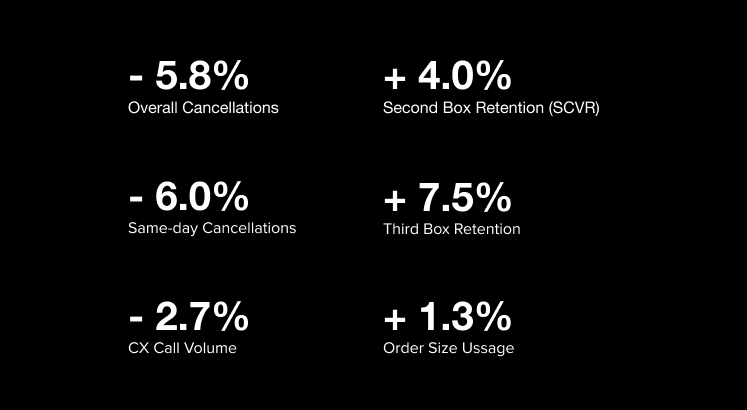
The new Plan screen resulted in a statistically significant increase.
in Order Size usage and reduction in CX call volume. These improvements also drove increases in second and third box retention rates.
The addition of the Welcome screen decreased both same-day and overall cancellation.
Finally, the revamped structure and CMS provided flexibility to conduct future experiments, particularly in testing new add-ons and features.